The Randomness of Putting
1 Introduction
Anyone who knows me knows that I’m an extremely avid golfer. I’ve played for a long time (with a depressingly high handicap to show for it) and don’t plan on stopping any time soon. Given my obsession with both math and golf, I’ve been very interested in its statistics and how mathematical techniques can be applied to the game for basically my entire adult life. Thankfully it’s a better time than ever before to be someone passionate about these two pursuits. There’s a ton of data to sink our teeth into that didn’t exist in years past, and I’d like to take advantage of this.
For my first attempt at golf modeling, I’d like to focus to a particularly frustrating part of golf for some: putting. Long believed to be the most important part of the game (”drive for show, putt for dough”), modern analytics are now showing it takes a back seat to both driving and iron play in terms of a professional’s ability to differentiate themselves from their peers. Why is this the case? While I don’t know definitively, I think it has to do with randomness. A ball rolling along the ground is subject to much more randomness than one flying through the air. There’s no shortage of debris or other obstacles that can deflect a ball as it rolls along, and there’s really nothing you can do about it. Now, I honestly don’t have a clue what governs putting on the ”micro” level, but I do know math. I’m curious if, with some assumptions, we can build a model of putting that can replicate putting stats for PGA tour pros.
2 So Just How Good Are Professional Putters?
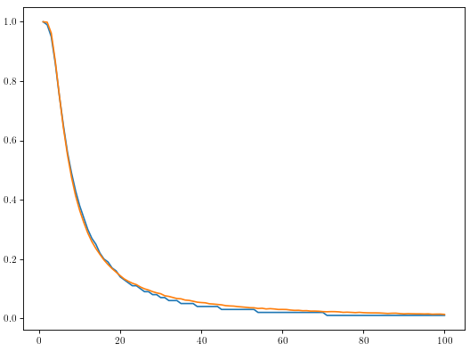
A natural question to start this analysis. I think the pga tour is somewhat generous sharing their data with academic institutions, but alas I’m just some guy and have to take what I can find on the internet. I found a post on forum somewhere that had the make percentages for all pga tour pros for every foot from 1 foot to 100 feet, and the data looks like it was released by the pga tour so I guess I have no choice but to trust it. Annoyingly it only displays 2 decimal places so a good deal of the probabilities are simply ”1%” but we’ll manage. Anyway enough rambling, here’s what it looks like:
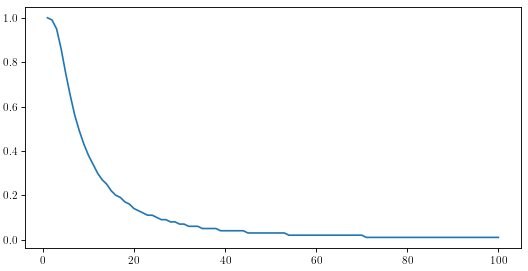
Percent chance pro golfers make a putt from a given distance up to 100 feet
Nothing too out of the ordinary, although one aspect has certainly caught my eye: why is the beginning of the curve downward sloping? For some reason I would have assumed it was more or less a constant decrease at first that then leveled off. Just to make it clear what I’m talking about, let’s go in for a closer look.
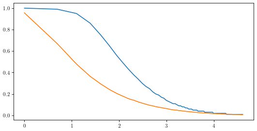
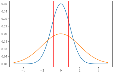
Actual (Blue) and Billy’s bad intuition (Orange) of make probability compared to ln(feet)
(Quick note: I plotted the figure against ln(feet) just to ”stretch out” the beginning part of the curve to make the pattern I’m describing more obvious.) Why does the additional foot going from 1 foot to 2 feet decrease your make probability by roughly 1%, but going from 2 feet to 3 feet decreases your probability by 4%? Going from 1 foot to 2 feet doubles the length of your putt, but 2 feet to 3 feet only increases its length by 50%, sooooo why does the 3rd foot have such a pronounced effect? I’m not really sure to be honest, so I suppose there’s nothing left to do but proceed with reckless modeling abandon and see if we can find out. (Minor spoiler: I’ll prove why this is the case mathematically in the appendix of this post, but in all honesty I can’t seem to tie it back to the real world within the framework of this model. More discussion on this in the appendix.)
3 Getting the Ball Rolling
Where do we even begin? Ideally I’d like to create some kind of Monte-Carlo simulation just to start wrapping my hands around this. Some thoughts:
-
My first intuition is to imagine a golf ball rolling along the ground: It very well could roll along its intended line, but there are little blades of grass, imperfections, and other debris on the green that could deflect it slightly and put it on a new heading. Just for simplicity let’s assume these ”deflections” are normally distributed with a mean of zero and standard deviation of 1 °.
-
Next, let’s also assume these little interactions only occur at the start of every foot, so if a putt is N feet long there are N independent instances where the ball may be deflected.
-
Now all we need is a way to determine whether a simulated putt goes in. A standard golf hole is 4.25” , meaning if we start our putt aimed at the middle of the hole, we have 2.125” of forgiveness in either direction. Since we know our heading at any point, and we know we’re moving in 1 foot increments, we can calculate how far we move up or down in each step
Now it feels like we’re getting somewhere. The above assumptions offer a way to simulate a putt using nothing but some code and random number generation. If you’ll indulge me for just a moment, I’m going to make a few additional assumptions just to simplify things as we start:
-
Putts are hit from the origin down the positive x-axis. It’s easiest for me to visualize putts this way.
-
The ball reaches the hole after N steps. Technically the ball only moves cos(θ) feet with each step, where θ is our current direction of travel relative to the x-axis, but the angles are usually so small these steps are very close to 1 foot anyway. (I actually tested this and the ball is within 1 foot of the hole after N steps basically every time. This is ”close enough” in my opinion, and has an extremely small impact on the results).
-
The person putting always hits their putt on their intended line, which is the correct line, with the correct speed (so the only way they would miss is due to random perturbations of their balls path due to the ground). Obviously this isn’t true, but for right now I just want to gauge the effect of the randomness.
-
Putts are ≤ 100 feet in length. Nothing crazy here, I just don’t have data beyond 100 feet.
-
100,000 putts will be simulated for each foot (I think this should be enough to converge to the ”real” value).
I know these axioms might sound completely unrealistic (particularly 3 in this second list) but once again I want to emphasize that I just want to see where this takes us. We can build on this once we’re on some solid footing. That being said, let’s carry on and see what sort of results our simulation generates:
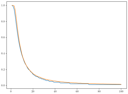
Comparison of model results (orange) and actual make probabilities (blue)
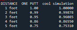
I’ll keep the language PG in case any children are reading, but rest assured I was very surprised when I saw these results for the first time. Now it’s far from perfect, but it feels like we’re barking up the right tree. Here is a table summarizing our results for the first five feet:
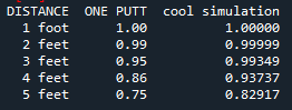
Table summarizing actual probabilities (ONE PUTT) with results from less than 5 feet from first simulation (cool simulation)
You’ll see that the model seems to overpredict on short putts by quite a bit. Interesting. Well clearly there is some work to be done. Let’s alter model to allow for slightly larger variance closer to the hole.
4 The Lumpy Donut
My friend Brad suggested this idea when I asked friends for help. Despite the absurd name for this concept, it’s actually quite logical. Golfers wear spiked shoes that indent greens, and virtually every golfer that plays a hole needs to walk near the hole to retrieve their ball once they’ve putted out. The result is spike marks tend to concentrate in a ”donut” between 1 and 6 feet from the hole, which I believe Dave Pelz coined ”the lumpy donut”. (If I’m not mistaken, nobody tends to step too close to the hole, so the ”lumpiness” begins at 1 foot.)
This is a fun idea, but I see no reason to limit the effect of spike marks to just a 6 foot circle. As we move further from the hole, there will be fewer spike marks, but they are still there and can deflect our putts. I think we should have a function that maximizes the effect of spike marks at 1 foot from the hole, and slowly diminishes their impact as we move further from the hole.
To try and build this function, let’s imagine the green is a gigantic bullseye, covered with concentric circles that are 1 foot thick all centered at the hole. Each golfer that plays a given hole will enter randomly from somewhere around the green and walk toward the hole on a roughly straight line taking a step every one foot. I recognize both of these are a little ridiculous, but I think it’s okay to make some simplifying assumptions when we’re really just reasoning about a candidate function. Anyway, if we have G golfers play in a given day, that means each ring in our bullseye will have G steps (i.e. spike marks) distributed throughout the ring. For the ring which starts at F feet and stretches to F + 1 feet, we have:
Updated Results in Tabular Form
As you can see now we're tracking with short putt probabilities pretty well. Maybe a little off from 3 feet if I'm being picky, but not enough cause for concern in my opinion. Here's what our update model model looks like from every distance:
Final Model predicted make probabilities (orange) compared to actual make probabilities (blue)
I’m a little bummed by the jaggedness of the blue line towards the end, but I’m satisfied with this result. The orange line tracks with the actual data quite well, and I bet you could tweak some of the parameters in the model to squeeze out a marginally better fit. I’ll leave it as is for right now though as we get ready to wrap up.
7 Additional Thoughts
So what does this mean? Have we solved putting? Absolutely not. Modeling can rarely "solve" anything, although it can help us understand it. That being said, I do feel pretty proud of this model, and it feels like a good foundation to build off of. After playing around with this I feel justified in my belief that there is an element of randomness in putting. ”But why does that matter?” you might ask. I guess it isn’t the strongest reason, but I think it would be valuable for a golfer (particularly a pro) to know if there was some theoretical maximum make percentage from a given distance. If nothing else, it could certainly help temper your expectations on the greens when playing (no matter how good you are, I think it’s virtually impossible to make all putts of 4 feet in length, so you just have to accept that you’ll miss some).
Also for what it’s worth, I just looked it up and there seems to be a lot more churn in the leaders in the ”strokes gained: putting” statistics between years than the ”strokes gained: tee to green” statistics. Names like Dustin Johnson, Rory McIlroy, Justin Thomas, and Jon Rahm are mainstays in the top ten of the tee to green categories going back many years (and are easily among the most recognizable names in the game today), whereas there is almost a completely different top ten for putting each year. (Denny McCarthy did lead the putting category two years in a row (2019 and 2020) but he dropped to 22nd in 2021.) Players famous for their long game seem to be able to keep themselves in the top ten much easier than those famous for putting ability. Interesting...
And although I’ve glossed over it somewhat for now, this will not be the last mention of strokes gained statistics. They effectively launched the moneyball era of golf and provide great insight into players’ abilities compared to their peers. It’s a bit of a longer term goal, but I’d like to see if I could extend some of the ideas in this write-up and work up to a strokes gained: putting model. I don’t want to give too much away, but I am wondering if there is a practical upper limit on a player’s strokes gained: putting statistic over the course of a season, and what kind of difference it makes to tweak putting ability by even a little bit. Which reminds me...
8 Wrapping Up
I suppose there is one last $fly \; in \; the \; ointment$ that needs to be addressed: the above model doesn’t account for difference in skill level between golfers. This might seem like a pretty big omission, but for the time being it is intentional. For what it’s worth I have an idea for how to include this and I think my idea is pretty simple: allow for variance in the first angle θ1 to be different from all other angles in the model based on the skill level of the golfer. It would still have mean zero, but stronger putters would have a smaller variance due to a better putting stroke and being better at reading putts. I’ve played around with this idea, but I don’t have the data to effectively measure whether or not this accurately models playing ability, so sadly I’ll have to save that analysis for a rainy day.
Anywho, I’m hoping that this will be the first of many posts on golf and data. In addition to the previously mentioned areas of further inquiry, here are a few additional areas I’d like to explore further:
-
How does standard deviation of our deflections change between grass types? Poa Annua grass is famously bumpy (and kind of an eyesore if I’m being honest) and I bet it deflects the ball way more than other grasses. I would love to see how the make percentage curve changes for different grass types.
-
Can we build a similar model for two putting and three putting, and derive a formula for strokes gained? I think we would need some idea of how frequently golfers were hitting putts of each length, but I still feel like there might be something worth looking into here. Bonus Points because my dataset contains two putt and three putt percentages so I will likely dig into this soon. (Just a hunch, but I’m guessing strokes gained over the course of a season is almost entirely determined by quality of putts less than ten feet.)
Anyway that’s all for now. For those looking for the answer to learn more about the shape of the curve please stick around as I was pretty pleased with the result of this section. It’s much more math heavy, but I really do think it’s interesting.
Appendix: But Why the Shape of the Curve?
For those of you who are curious as to why the curve looks how it does, I’ve got a good grasp on why it happens mathematically. Also note that I specifically mean within the context of this model. I tried a number of other models that generated fairly similar results and offered a more intuitive explanation, but they weren't a good as this model. I’m still struggling as to how this mathematical truth translates to something more tangible in the real world, but I figure it’s still interesting to see the math that proves it.
Normal distributions with differing standard deviations and different area between critical values
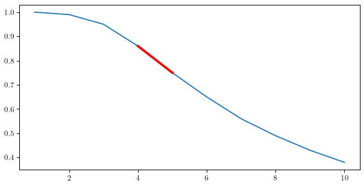
I've highlighted the 4-5 foot range in red for visibility, and I think it's very obvious that the inflection point falls within that range. Needless to say I'm very excited about this result. Based on our model, it looks like our inflection point is determined by the size of the hole. Not the most surprising result I guess, although I do think it's cool that we can calculate the exact foot where the inflection point is using our model.
I'd also like to point out that this seems to imply that any process that might be governed by a normal distribution (which is actually lot of things thanks to the central limit theorem) and fixed critical values should exhibit similar behavior. In fact now that I think about it, a lot of sports phenomena should behave like this. Three that come to mind are kicking field goals, shooting a basketball, and scoring goals in soccer. Those last two are probably a little more complicated given the effects different angle might have, but who knows, I bet we could learn something interesting if we investigate them.